The Top 15 Popular Logo Redesigns of 2021
- Jun 22, 2022
- 4 min read
See some of the best logo redesigns from around the world, and learn what makes them so great. We also have a few tips on how to design your own!

Some of the best-known brands have changed up their logos this year, and it’s our job to figure out why. What elements have changed? What’s stayed the same? We’re about to take a look at some of the best logo redesigns of 2021, and hopefully extract some sweet, juicy insights that you can use to give your own logo some flavor.
Best Logo Redesigns from around the world in 2021
If you’ve been paying attention to logo design trends in the past few years, you know that many brands have been changing up their logos. Whether it be a subtle tweak or a complete overhaul, these changes are happening for a reason. In this article we will take a look at some of the most notable logo redesigns from this year and talk about what changed and why it was done. Hopefully by reading this post you can get some insights into how to make your own logo stand out among the competition!
So what are some of the biggest changes we’ve seen in logos this year? Let’s take a look at some of the most popular redesigns from 2021:
1. Meta (formerly Facebook) Logo Redesign
One of the most notable logo redesigns this year was Facebook’s rebrand to Meta. The new logo is completely different from the old one, and features a more modern look that represents their focus on data and AI. Some other changes include a shift away from blue (which has been used by Facebook for over a decade) and a new font.
2. Pfizer Logo Redesign

One of the biggest logo redesigns this year was from pharmaceutical company Pfizer. They replaced their old design with a new one meant to emphasize their focus on science and innovation in healthcare, as well as an attempt to distance themselves from any negative association that they may have had in the past. It’s quite different from their old logo, which was designed in 1967 and featured a more classic look.
3. Planters Logo Redesign

Kraft decided to rebrand their Planters products under the name “Planters”, and it happened back in 2016. The new logo is brighter than before, features a more modern look, and will hopefully help them reach younger customers with its revamped design. Some other changes included are an updated font for the word “Planters”, a new color scheme, and an emphasis on the word “nuts”.
4. GM (General Motors) Logo Redesign

GM decided to go for a complete overhaul of their logo in 2021, and the new design is much more modern than the old one. The redesign was meant to help them appeal to a younger audience, as well as emphasize their focus on electric vehicles. Some other changes include a new font and color scheme that are much more modern than before.
5. CIA Logo Redesign

The Central Intelligence Agency also decided to redesign their logo this year, and it’s quite different from the old one. The main change is that they removed the eagle from their logo and replaced it with a simple shield. This was done in order to emphasize their focus on secrecy and national security. Some other changes include a new font and a shift from blue to red
6. Peugeot Logo Redesign

Peugeot also decided to give their logo a makeover this year, and it’s quite different from the old one. The new logo is more minimalist and features a sleek design that they hope will help them appeal to younger customers. Some other changes include a new font and color scheme.
7. Renault Logo Redesign

The new design was meant as an homage to Renault’s long history of automotive innovation (they were founded in 1899). The new logo features a more modern look, as well as an emphasis on the Renault diamond. They also decided to change their font.
8. Sweetgreen Logo Redesign

Sweetgreen also decided to give their logo a makeover this year. The new design is more modern and features a simple, minimalist design.
9. Discord Logo Redesign

This is a lovely new look for Discord’s logo. The iconic logo was somehow simplified while remaining the same. They modified the typeface as well, giving it a much simpler and bold look.
10. Paramount Logo Redesign

The new Paramount logo is a lovely revamp to their old one. The design features the same shield shape, but with a more modern look
11. National Gallery of Art Logo Redesign
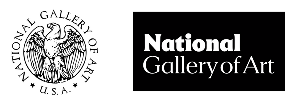
The National Gallery of Art decided to give their logo a modern revamp this year. The new design is much more minimalist, and features a cleaner and more modern look. The updated logo gets rid of the eagle symbol and only focuses on the essential word mark.
12. Volvo Logo Redesign

Volvo is another automobile brand that decided to give their logo a makeover this year. The new design is more modern and features a sleek, minimalist design. They maintained the overall design but stripped it down, as we’ve seen on previous rebrands. The logos no longer have 3D shading.
13. Godaddy Logo Redesign

The new Godaddy logo is a refreshing change from their old one. The updated design features a totally new icon and a bolder new typeface. The arrow on the letter G in the wordmark also refers to growth of GoDaddy and the businesses started with its service.
14. Papa John’s Logo Redesign

The new Papa John’s logo is a refreshing change from their old one. The updated design features a totally new icon and bold typography that reflects their commitment to quality. The Papa John’s logo is now more legible at a smaller size and can be used in a wider range of contexts.
15. ABC Logo Redesign

ABC also decided to give their logo a makeover this year. The new design is more modern and features a cleaner, more minimalist look.


Comments